Netflix Redesign
Content browsing reimagined
Brief
A User Interface Design project at The IT University of Copenhagen exploring streaming platforms.
A complete overhaul of Netflix’s suggestion engine experience built as a Figma Prototype - with a twist of neon.
Responsible for research, ideation, Figma prototyping, testing, and presentation.


Task
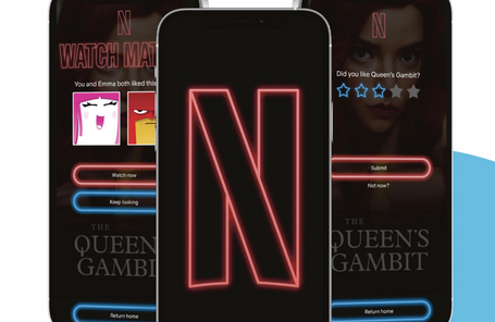
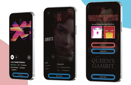
For a User Interface Design course at The IT University of Copenhagen in 2021, we were asked to rethink interaction with our favorite streaming services. The prototype was to be fully interactive and built in Figma. Our group decided to take on Netflix’s browsing experience, which we found to be somewhat lacking - particularly on mobile. We wanted to create a more immersive experience, which led us to present video content in portrait mode, filling up the entire screen. Likewise, we wanted to experiment with a custom theme and an improved rating system. This prototype was part of an exam project, along with a written report for which we received top marks.
Solution
The experience was built using Figma, which became my own primary responsibility throughout. The solution was inspired by Tinder’s gesture-based mechanics - Swipe right to add a show or movie to your Watch List or left to show that you are not interested. If another profile on a shared Netflix account has added the same piece of content to their Watch List, a feature we built called ‘Watch Match’ lets you know so that you can watch the show together later. We also applied a 1920s-style neon theme to the app, honoring classic cinema. Likewise, we challenged Netflix’s over-simplified like/dislike rating system, reverting back to a five-star rating system. Since then the rating system of Netflix has moved into a hybrid form between the two approaches.